
Appearance
Store & checkout
Everything here lives in Blast Studio → Store & checkout. All products, plans and prices come from Paymenter — Blast only presents them.
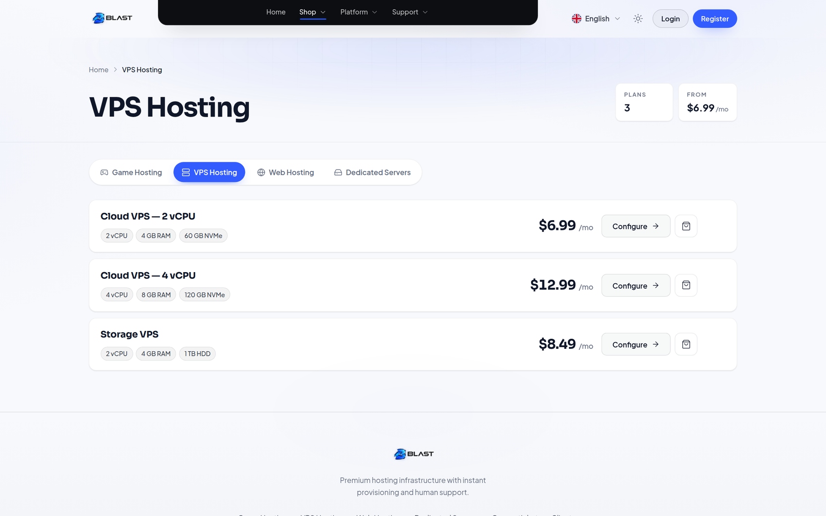
Category pages
Five layouts
| Design | Character |
|---|---|
| Cards | The classic plan-card grid — the best all-round choice |
| Rows | Horizontal rows, good for long product names and many features |
| Compare | A side-by-side table, so customers can compare plans feature by feature |
| Spotlight | One featured product large at the top, the rest in a grid below |
| Compact | Dense tiles for stores with many similar products |
Category header
- Banner — a decorative gradient banner with the category name, product count, "from" price and billing options. The most premium option.
- Simple — a plain compact heading.
Controls
| Setting | What it does |
|---|---|
| Columns | 2, 3 or 4 columns on the card layouts |
| Category navigation | Tabs, a sidebar list, or none |
| Billing period switch | Filter prices by month, quarter or year — only periods your products really have appear |
| Default period | Which period is selected first |
| Monthly equivalent | Show a per-month equivalent under longer billing periods |
| Feature list | Show product features on cards, and how many per card |
| Highlighted products | Slugs of products to visually feature |
| Product badges | Slugs of products that get a badge |
| Low-stock notice | Show a small "only n left" note below this stock count |
| Sort products | Manual order, price ascending or descending, or name |
| Card / featured / out-of-stock labels | Rename the card actions |
| Trust row | Small icon and text promises under the header, such as setup time or support |
| Sub-categories | Show child categories as cards or compact chips |
Product pages
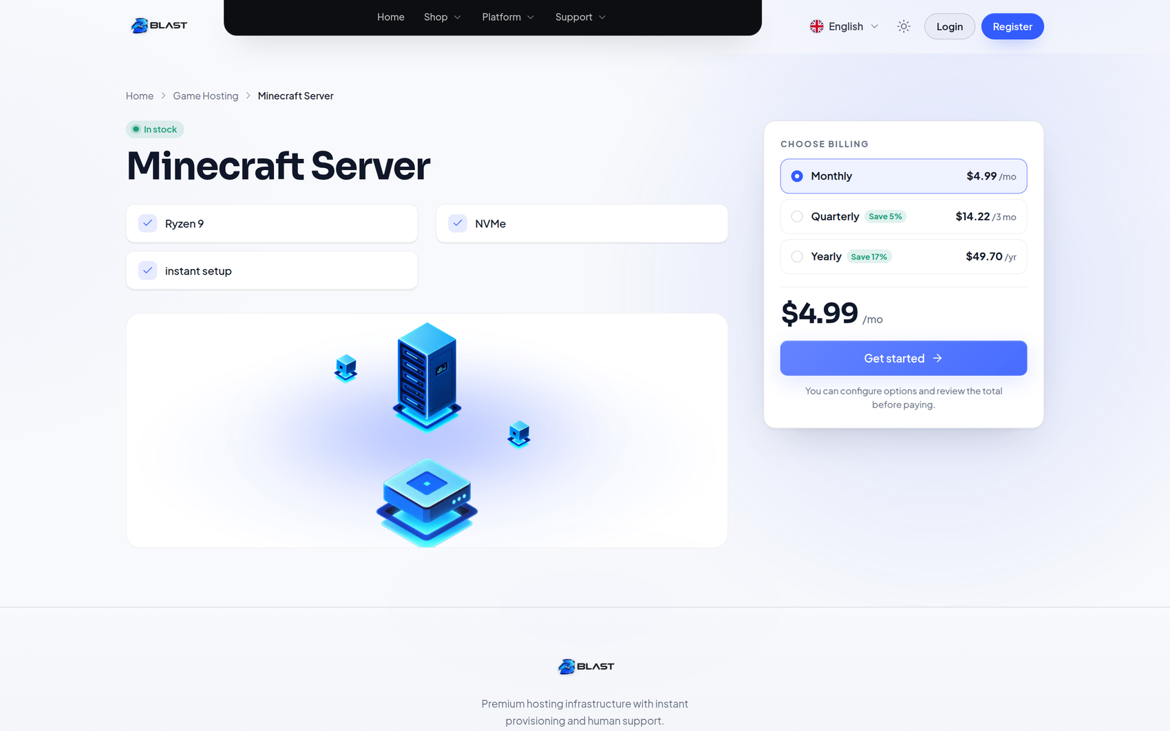
Each product page shows the product's real description, features, plans and stock, in one of two layouts:
- Split — details on the left, a sticky purchase card on the right.
- Stacked — full-width stacked panels.
Product visual chooses what decorates the header: Blast's scene artwork, an image you upload, or none for a clean typographic header.
Product builder
Store & checkout → Product builder adds presentation details to any product, edited visually with the product open in the preview. Pick a product from the menu; products that already have details are listed as chips.
| Detail | Where it shows |
|---|---|
| Badge | Most popular, Best value, Recommended, New, Sale, or your own text in blue, green, amber or grey. Shown on category cards, the product page and the homepage Pricing section, and used as the Spotlight label |
| Highlight on category pages | Gives the product the featured card style, also on the homepage Pricing section |
| Tagline | One line under the product name — product page, cards and homepage Pricing |
| Specs | Rows of icon, label and value such as Memory · 8 GB DDR5. A spec grid on the product page, a compact list on cards, and aligned rows in the Compare table so products with the same spec label line up |
| Images | A gallery on the product page with thumbnails. The first image is also used on cards when the product has no Paymenter image |
| FAQ | Questions and answers below the product page, also added to the page's structured data |
On the product page, specs replace the bullet list Blast reads from the product description; a longer written description is still shown. Specs on category cards switches the card specs off if you prefer description bullets. Specifications heading and Product FAQ heading rename the two headings.
Presentation only
Plans, prices, stock and checkout always remain Paymenter's. The product builder only adds presentation.
Product configurator
The page where customers pick their billing period and options before adding to cart. All real Paymenter options are rendered — billing cycles, configurable options, extra fields and stock.
| Setting | What it does |
|---|---|
| Config layout | Split or stacked |
| Sticky summary | Keep the order summary visible while scrolling |
| Order summary panel | Show or hide the summary block |
| Option price modifiers | Show +€2.00 style indicators next to paid options |
| Add to cart / back link labels | Rename the buttons |
| Section labels | Rename the Billing and Additional information headings |
Cart
| Setting | What it does |
|---|---|
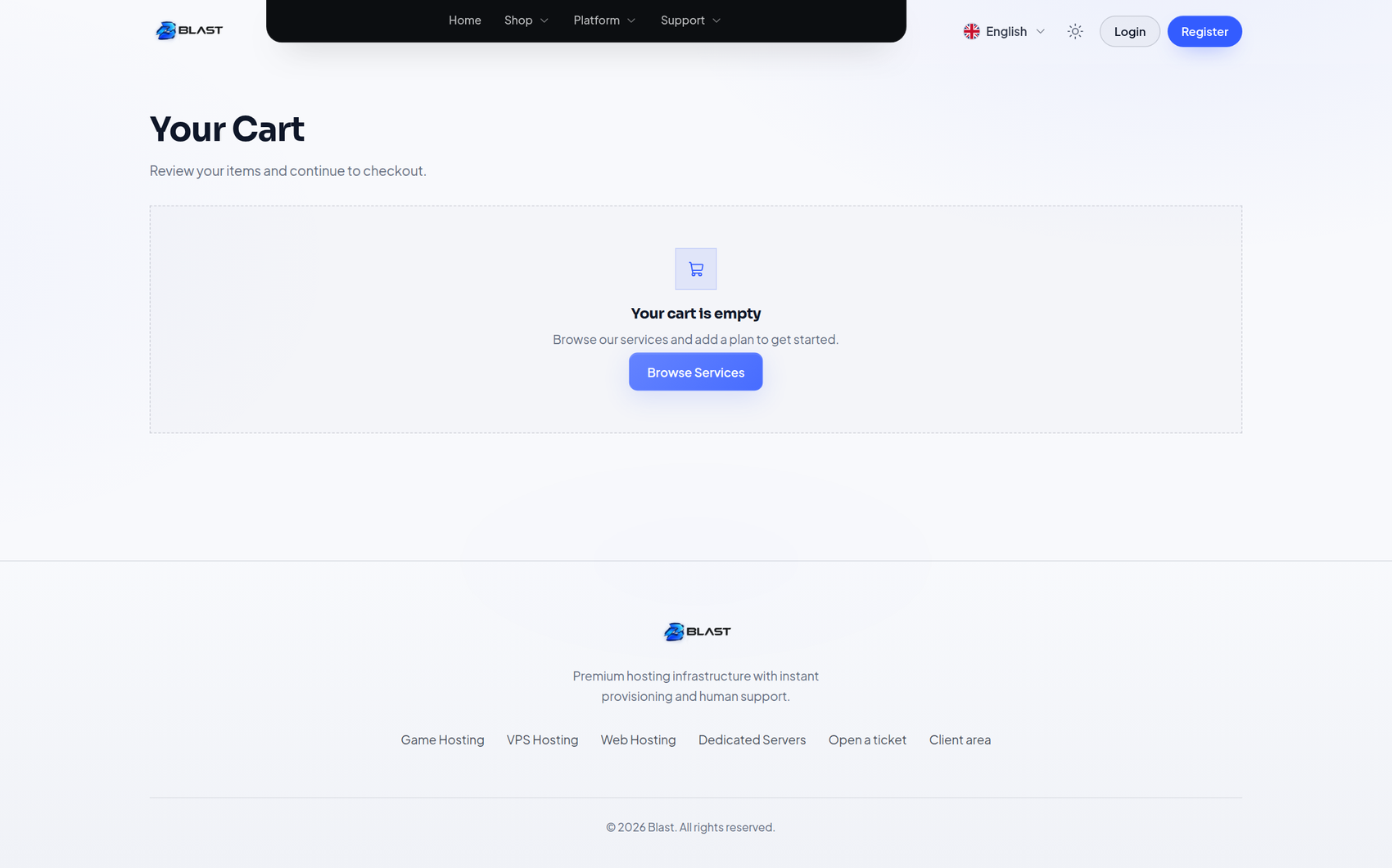
| Cart heading and description | Rename the text |
| Checkout label | Rename the checkout button |
| Sticky summary | Keep totals visible while scrolling |
| Show product images | Auto, or off for a purely typographic cart |
| Empty state | Text and button for an empty cart |
Sign in from the cart
With Sign in on the cart on (the default), guests see a sign-in panel right under their cart items with two tabs — I have an account and I'm new here — instead of being sent away to the sign-in page.
It is Paymenter's own sign-in and registration, including validation, two-factor, captcha, required account fields and terms. Afterwards the customer lands back on the cart with everything still in it. This also works for social sign-in and two-factor sign-in. The order summary button reads Sign in to check out and jumps to the panel.
Rename the panel with Sign-in panel title and Sign-in panel text.
Checkout progress bar
A three-step bar — Configure → Review → Payment — on the configurator, the cart and the payment page of the invoice created at checkout. Completed steps get a tick. Turn it off or rename the steps under Checkout progress.
Checkout and billing
Checkout is Paymenter's own flow, styled by Blast. Card, wallet and gateway options come from your configured Paymenter gateways and appear in the theme's card style automatically.
Test the full flow once
To try a purchase yourself, enable a test gateway — for example your gateway's sandbox mode — and place a small test order. Blast does not provide or configure payment gateways.
Store behaviour
Under Style → Store behaviour you will find Paymenter's own options, styled by Blast:
- Direct Checkout — skip the product overview and go straight to the configurator from category cards.
- Small Images — compact product imagery in overviews.
- Show Category Description — show or hide the category description block.