
Appearance
Client area
Everything here lives in Blast Studio → Client area. The client area is where customers manage services, invoices and tickets — Blast gives it the same treatment as the storefront.
Layouts
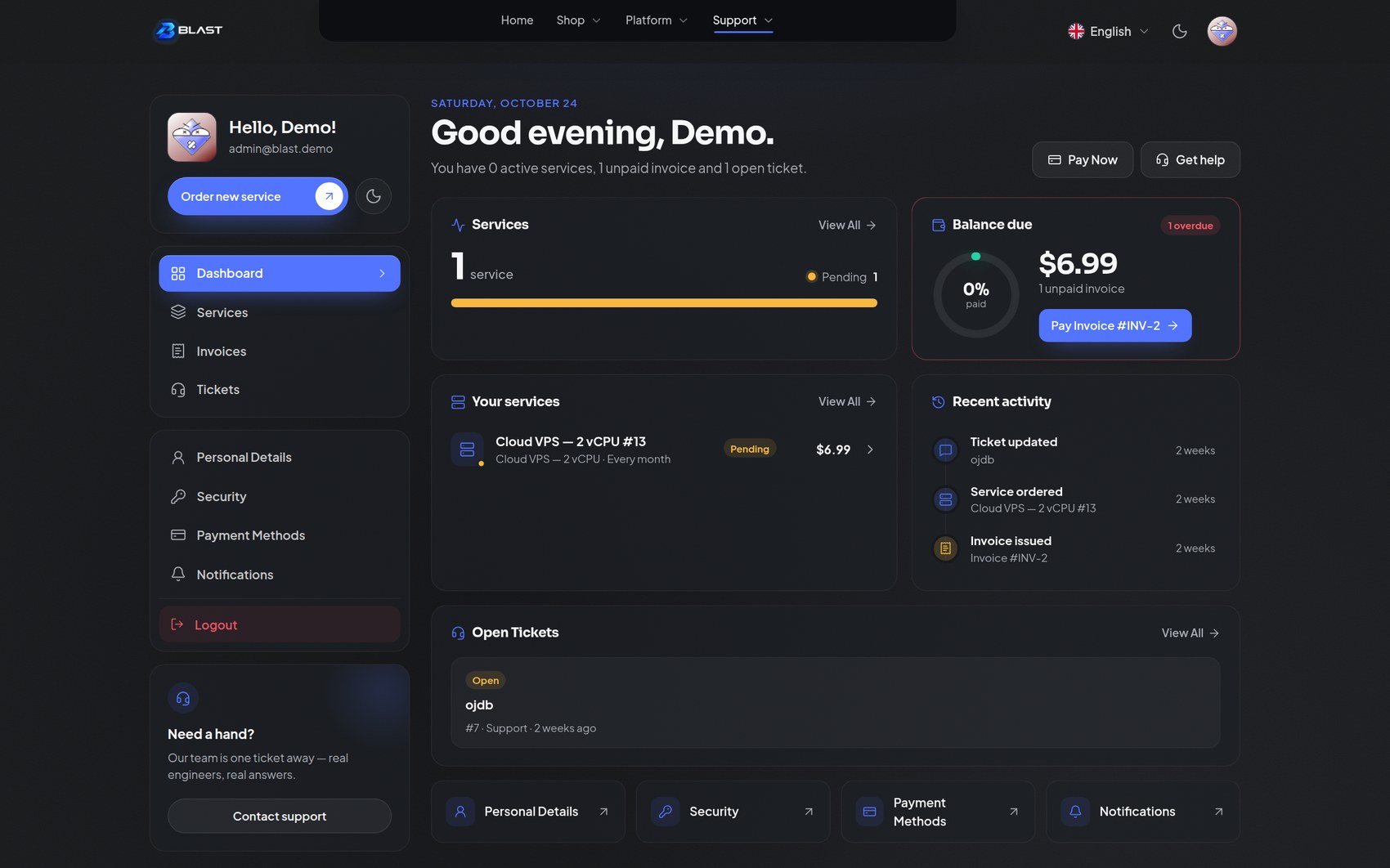
Five complete layouts. Pick one with Client area layout.
| Layout | Character |
|---|---|
| Floating dock (default) | Navigation in a floating dock, content at full width. Modern and app-like |
| Command rail | A slim icon rail on the left that expands on hover, with labels |
| App | A fixed sidebar with grouped links — the familiar dashboard pattern |
| Tabs | Horizontal tab navigation under a site header. Familiar and compact |
| Cards | A card-based navigation hub, good for stores with few sections |
All five share the same pages underneath: dashboard, services, invoices, tickets and account.
Personalisation
| Setting | What it does |
|---|---|
| Search palette (Ctrl/⌘ + K) | A command palette for the client area — jump to any page or action from the keyboard |
| Dock labels | Show navigation labels on hover, or always, in the dock layout |
| Profile card | A "Hello, {name}!" card at the top of every layout, with avatar, e-mail and the order button |
| Greeting | Rename "Hello" if you like |
| Order button label and URL | Rename the button and choose where customers are sent to order |
| Theme toggle | Let customers switch light and dark themselves |
| Help card | A support card with title, text, button and link |
Sidebar
For the app and rail layouts:
- Sidebar width — compact, normal or wide.
- Sidebar position — left or right.
- Collapsible sidebar — let customers collapse it.
- Active item style — solid, soft, indicator or minimal. This single setting changes the feel of the whole client area.
- Group labels and icons — show or hide grouping headers and icons.
- Sidebar logo — full logo or compact mark.
- Custom navigation links — add your own, one per line as
Label | URL | icon.
Dashboard
Two dashboard designs.
- Overview (default) — a modern summary: a greeting with live service and invoice counts, a services card with status breakdown, a next-renewal card, a balance-due card with a progress ring, recent activity, your services list and account shortcut tiles.
- Classic — the welcome-banner style with stats and sections underneath.
Options include the greeting, which adapts to the time of day; the welcome banner artwork (Blast scene, your own image, or a gradient, in three heights); the stats row; the next-renewal stat; how many items each section shows; and whether to show services, invoices, tickets, quick actions and recent activity at all. Every element can be switched off individually.
Services, billing and tickets
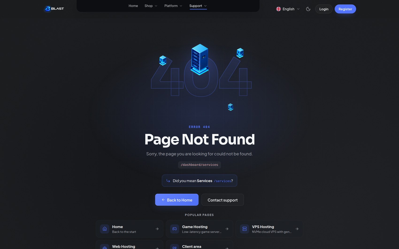
Each list page has editable heading and description text, plus an empty-state title and text, so you can match your brand voice everywhere. Services also offer a row or card item style, status filters and a primary "Order new service" action.
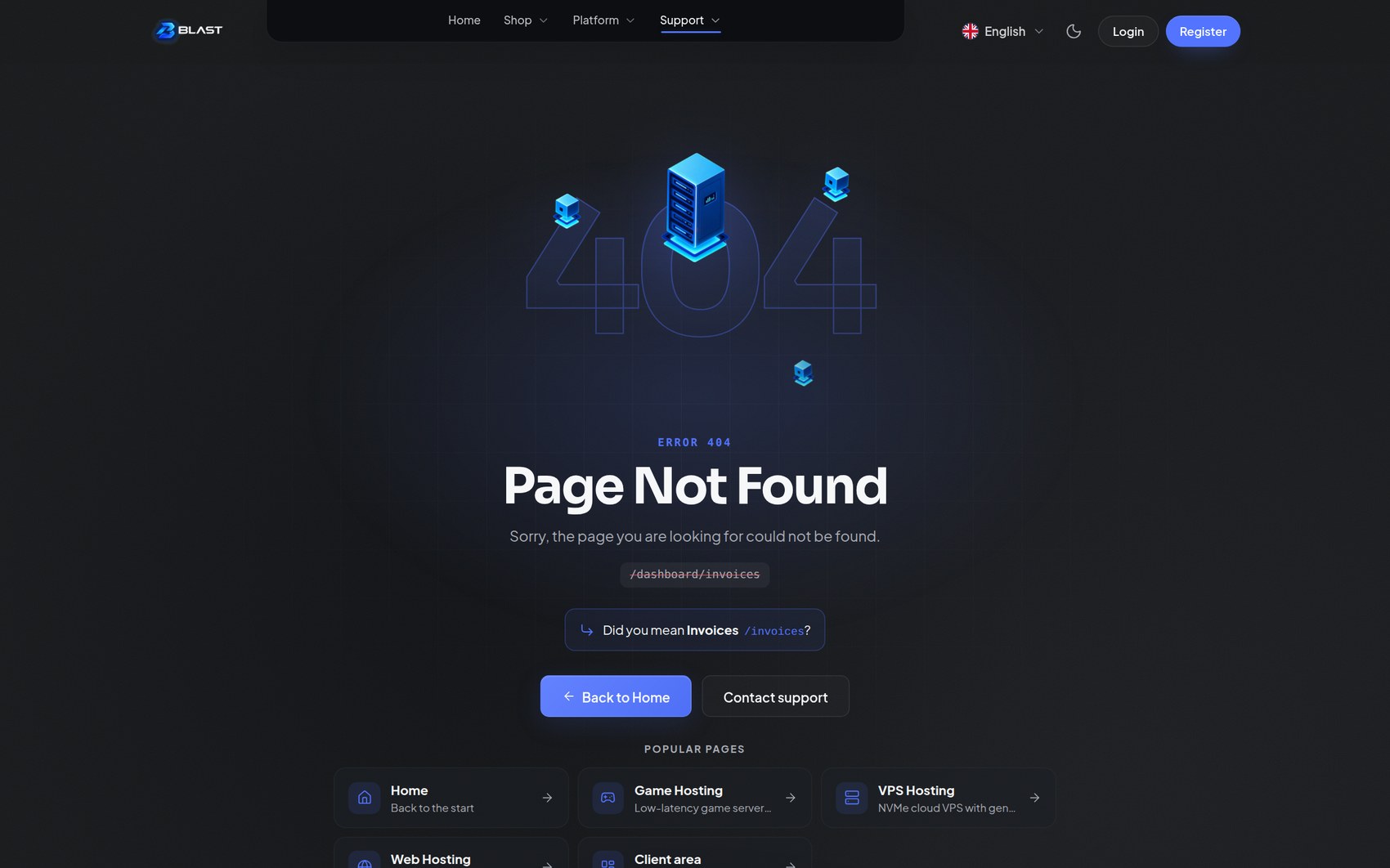 | 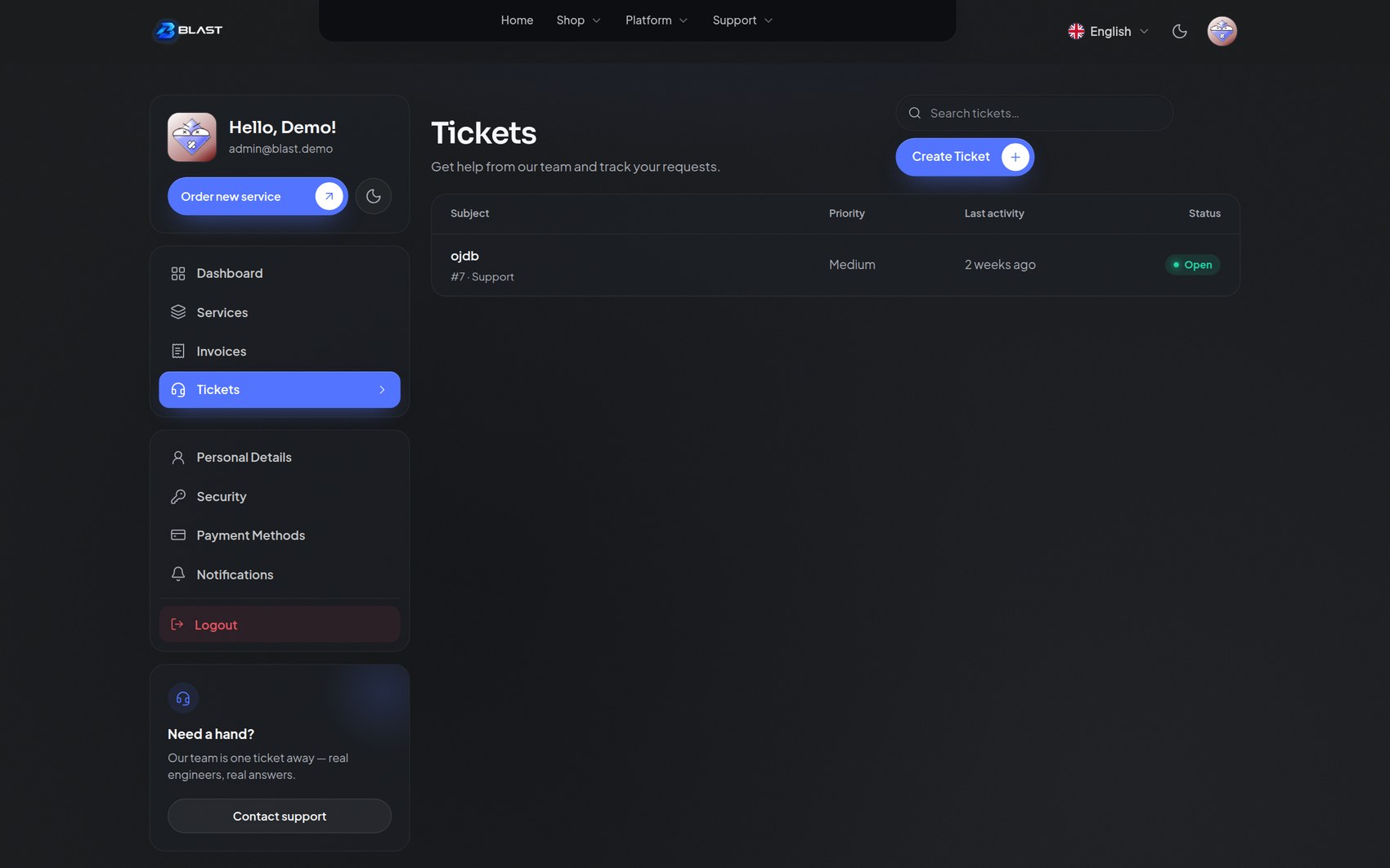 |
| Invoices | Tickets |
Command palette
With the palette enabled, customers press Ctrl/⌘ + K anywhere in the client area to search pages and actions — services, invoices, tickets, account pages — and jump straight there. It is fully keyboard-driven: type, arrow, Enter.
Theme toggle
Customers can switch light and dark from the client area, matching the header toggle on the storefront. Their choice is remembered per browser.
Mobile
Every layout adapts to phones: the dock stays thumb-reachable, the app sidebar becomes a drawer with a selectable side, and the search palette works with the same keyboard shortcut on tablets with keyboards. The account menu is always one tap away from the avatar.