
Appearance
Screenshots
Captures from a live Blast build on Paymenter 1.5.9. The storefront was captured at 1600×1000; the mobile screens at 390×844.
Homepage
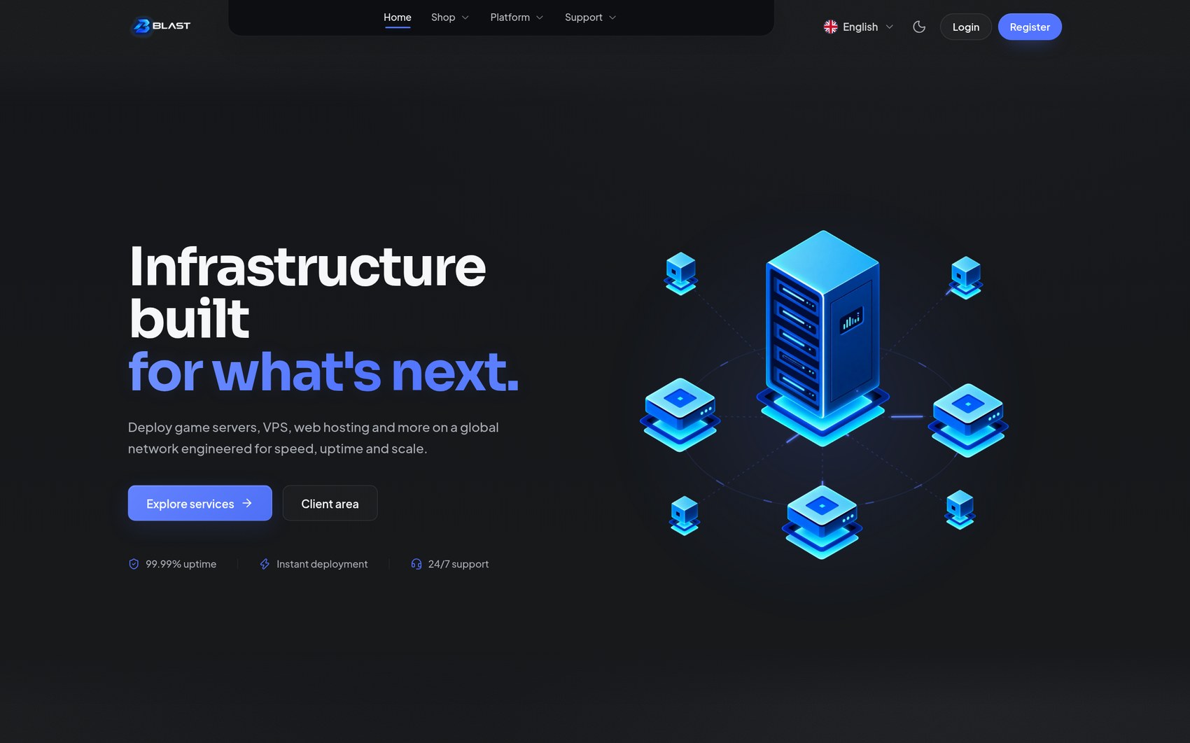 | 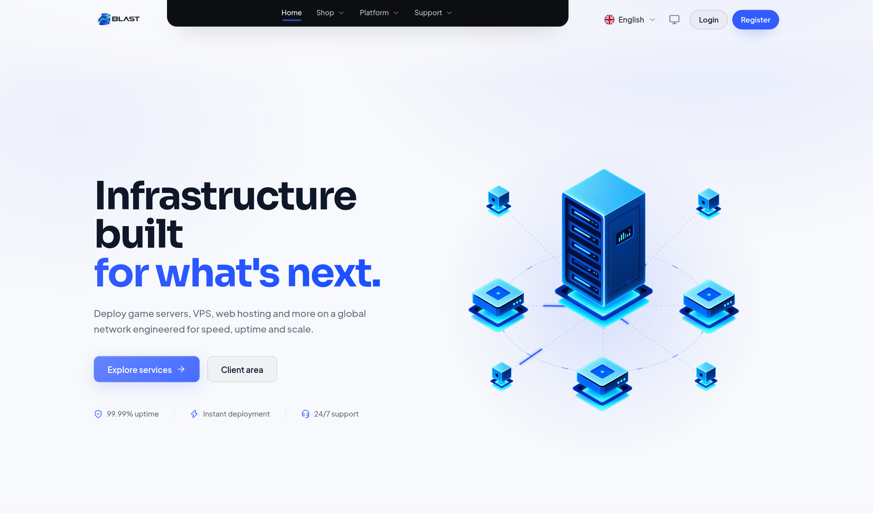 |
| Dark — the default charcoal look | Light — the designed light twin |
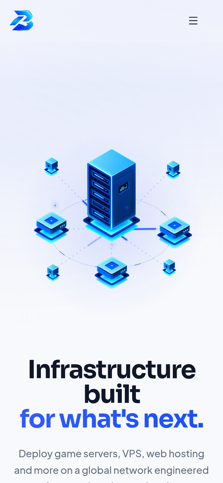
Store and checkout
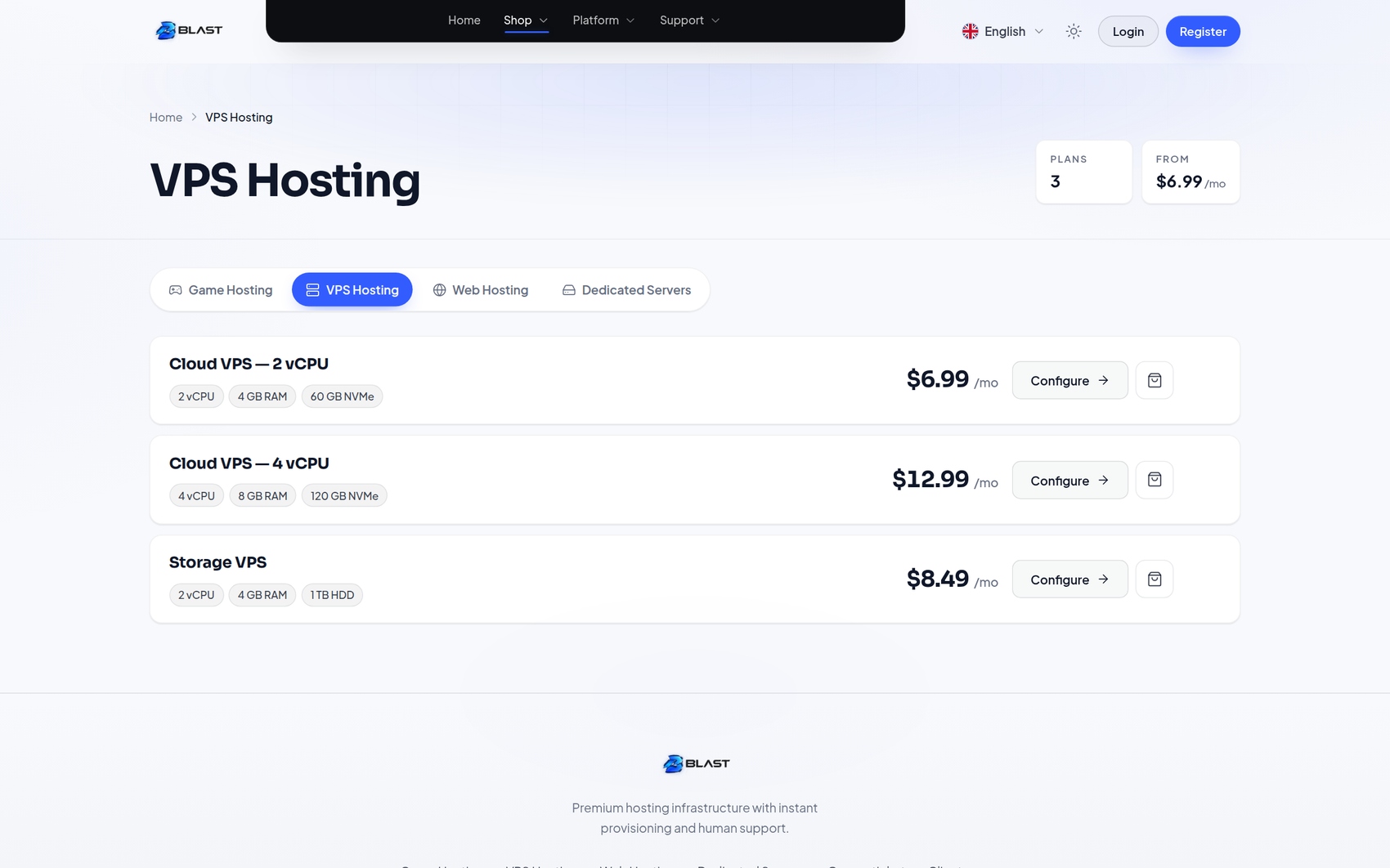 | 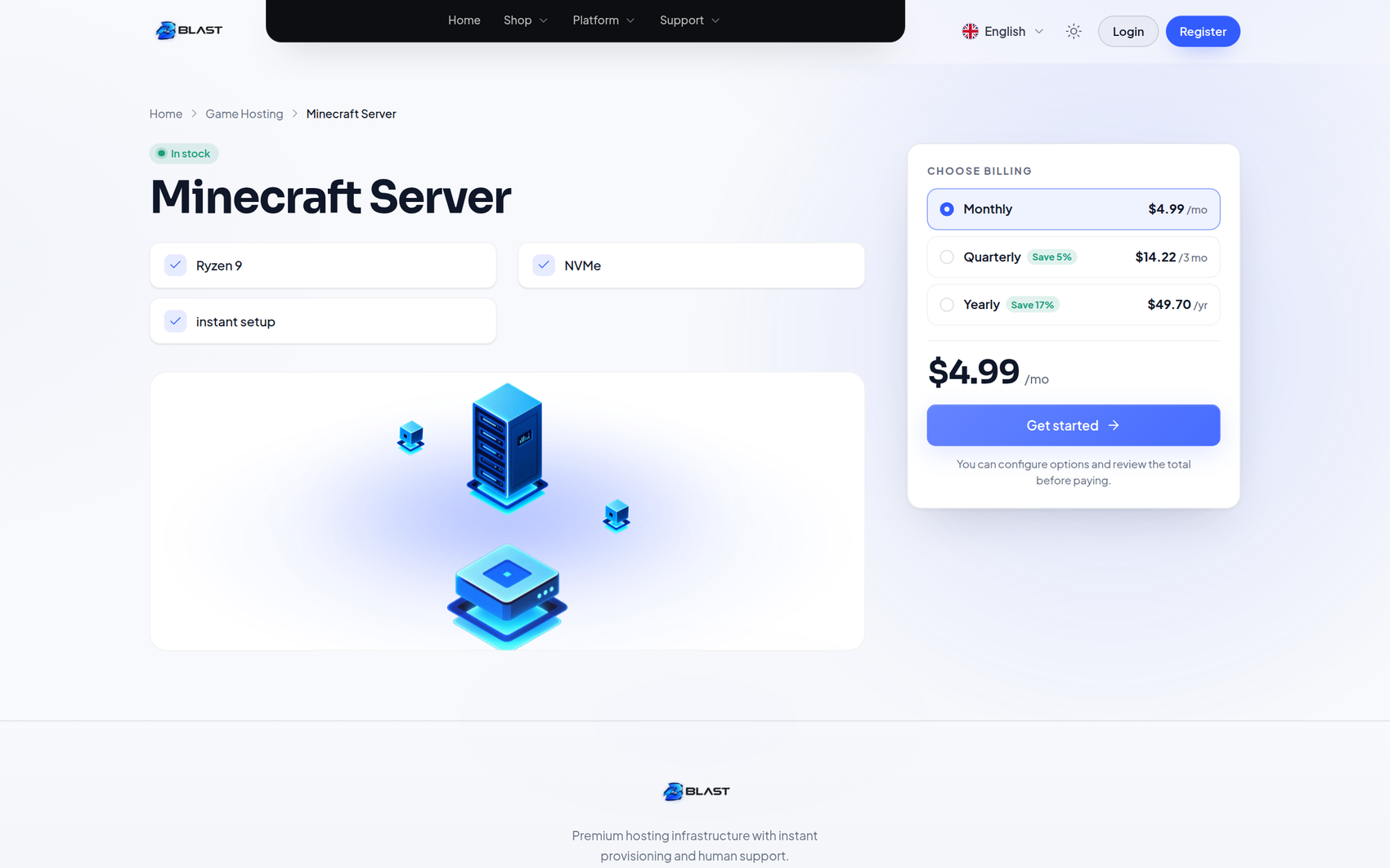 |
| Category page — product cards with real prices | Product page — configurator, specs and FAQ |
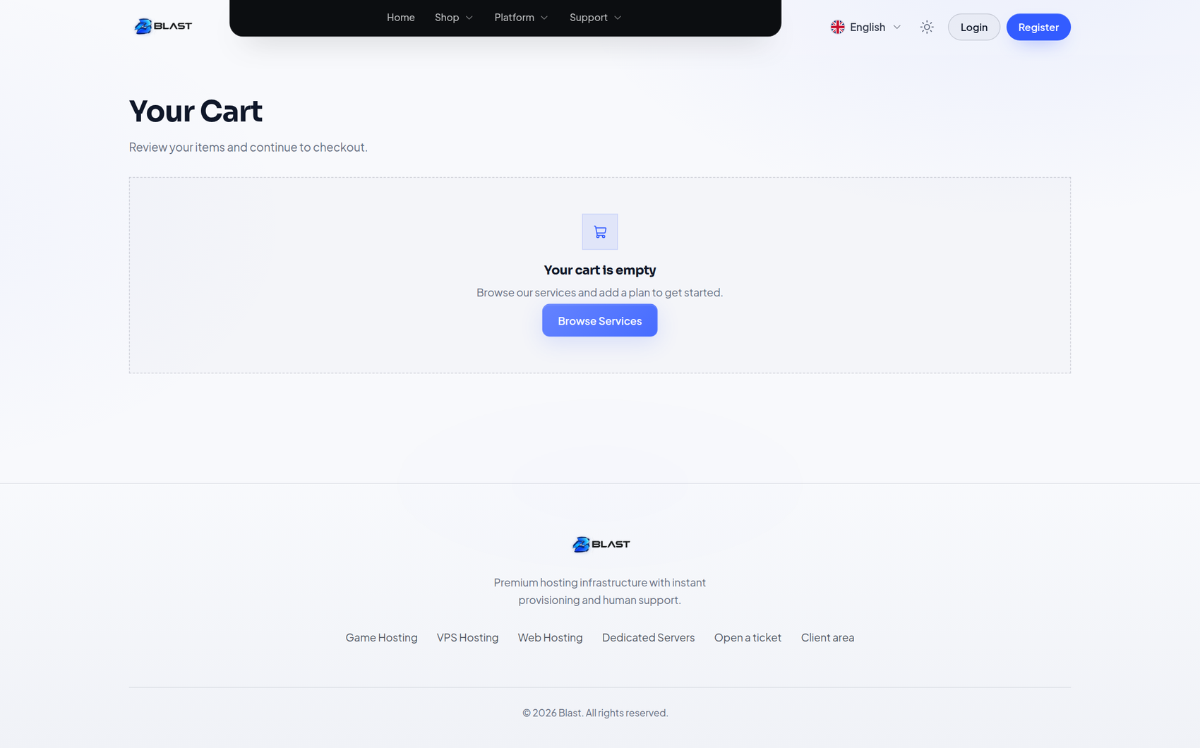 | 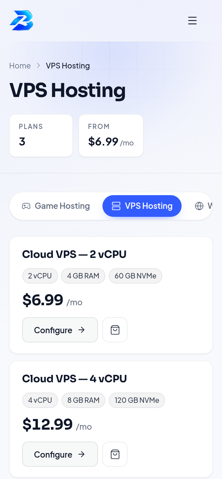 |
| Cart — sign-in panel and checkout progress | Store on a phone |
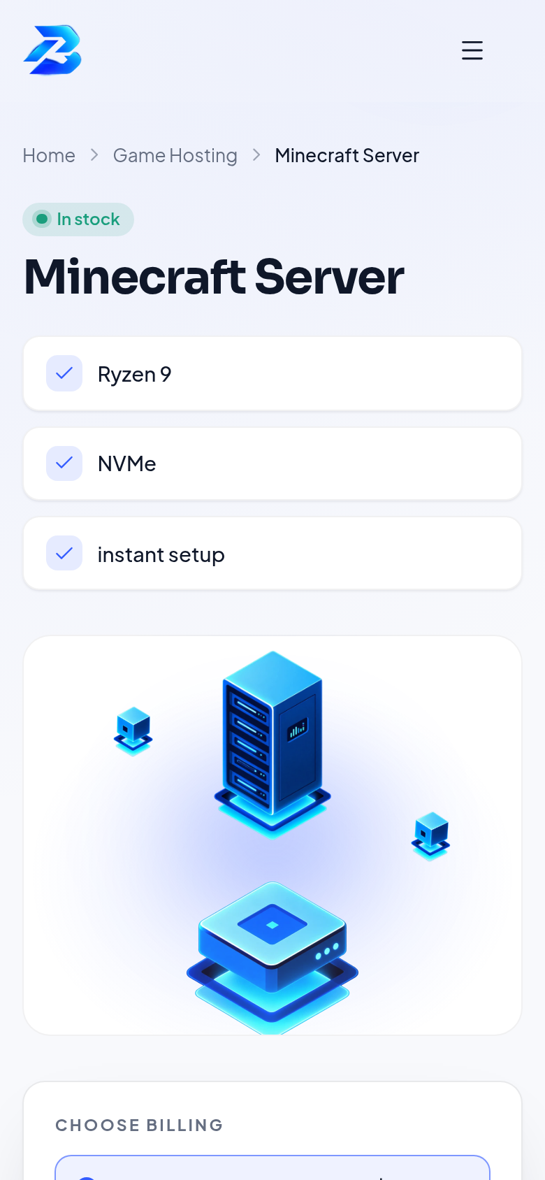
Sign-in
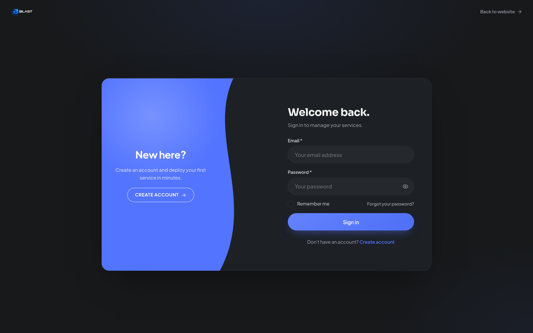 | 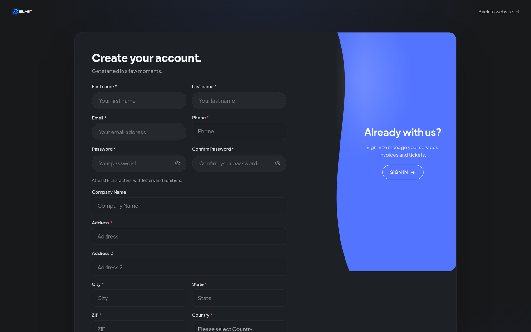 |
| Sign in — the auth design with the visual panel | Register — same design, registration form |
Client area
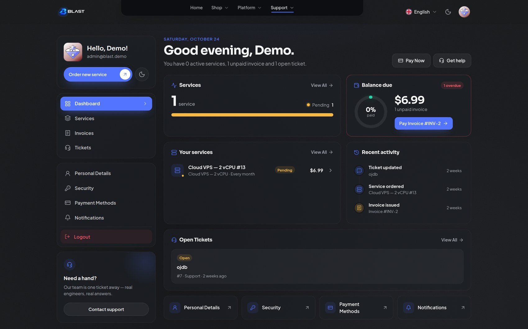 |  |
| Dashboard — services, balance due and activity | Services |
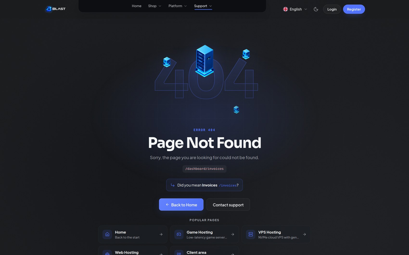 | 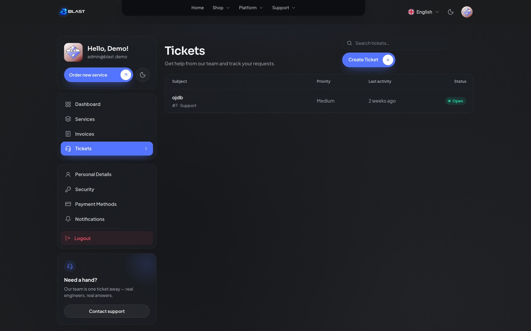 |
| Invoices | Tickets — sidebar and list |
Errors and the editor
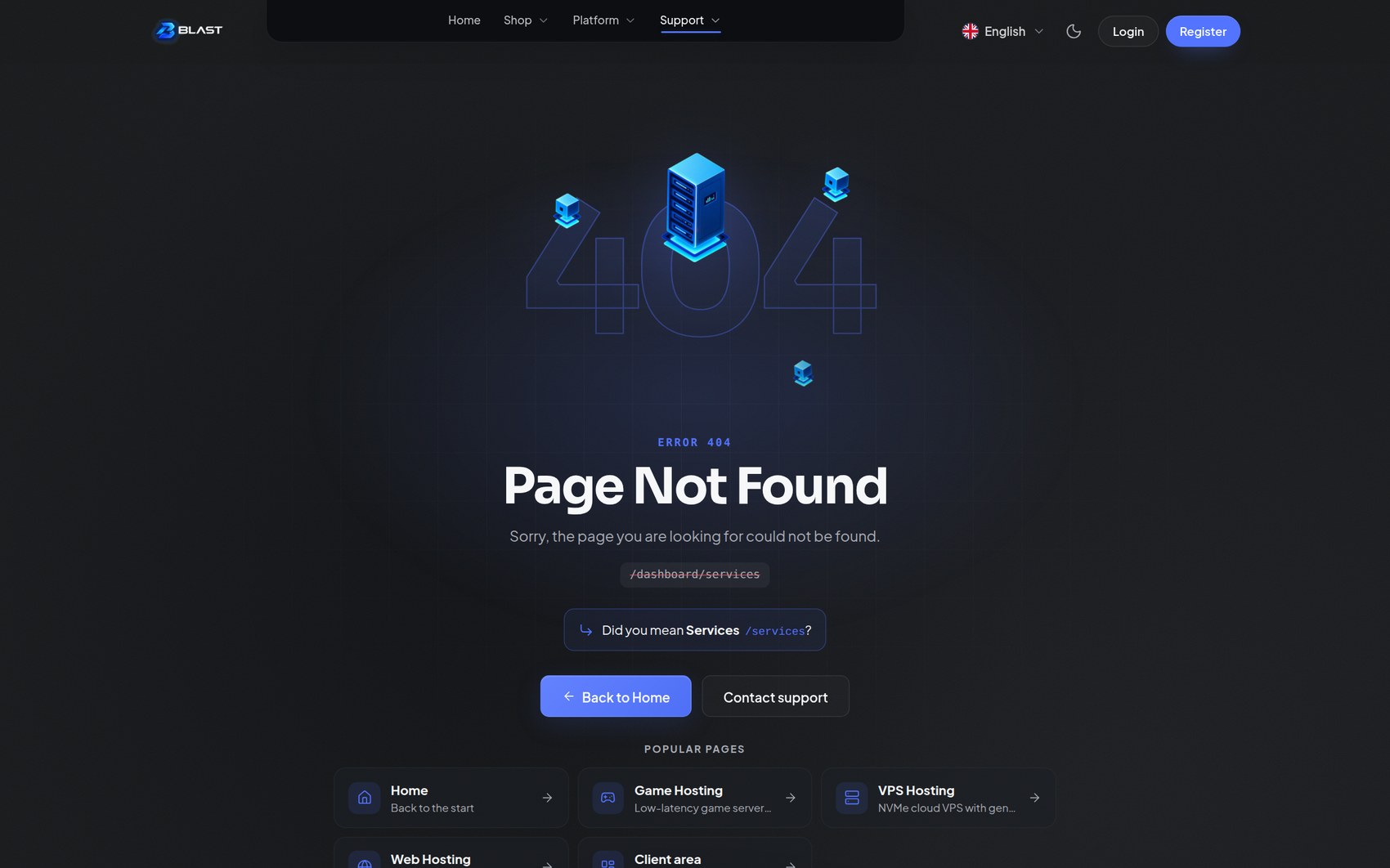
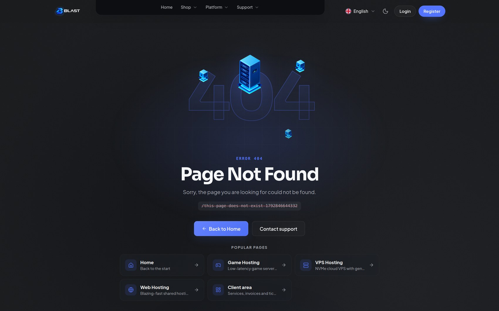 | 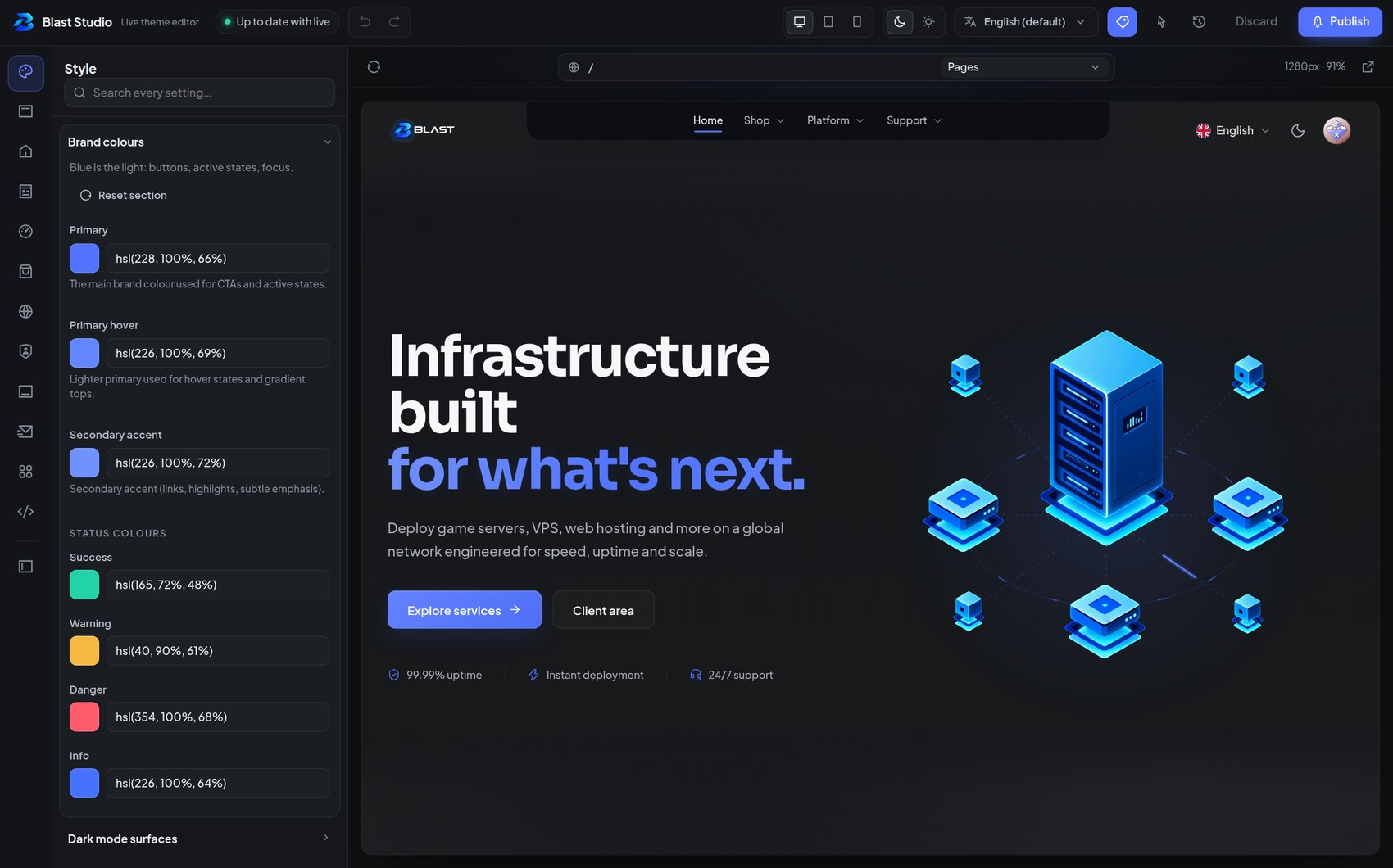 |
| 404 — with "Did you mean…?" and popular pages | Blast Studio — the full-page live editor |
Notes on these shots
- The header capsule is charcoal in both modes. That is the Notch header variant by design — a dark island that stays dark in light mode, with light text inside it. If you prefer a header that follows the page, switch Header & menu → Header layout to Classic, Floating glass, Island pill or Morphing capsule.
- The UI text is real demo content, not placeholders. The ticket names and the unpaid invoice are simply what the demo database contained.
- The account shown is a neutral demo identity. No real customer data appears in any screenshot.
- Dark and light were captured from the same build using the header's moon/sun toggle, so you are comparing the same page in the two designed modes.