
Appearance
Homepage
The homepage is assembled from sections. Turn them on or off and drag them into any order in Blast Studio → Homepage → Sections & order.
Most sections come with three designs — switch between them in the panel and the preview updates instantly. Five sections are off until you switch them on: Games grid, Stats, Logo cloud, Gallery and Text.
Want a completely different homepage? Build one in the Page builder and switch on Use as homepage.
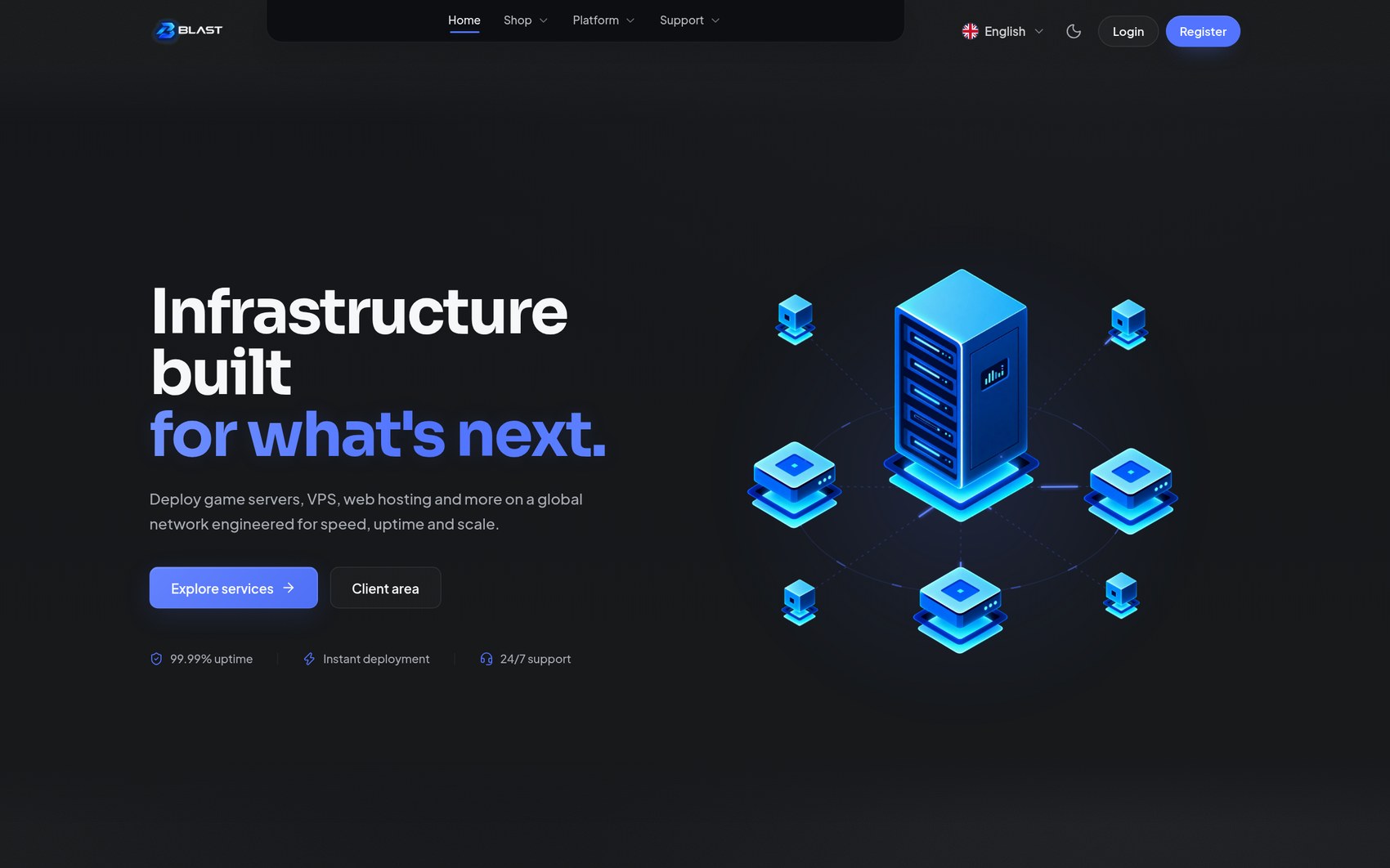
Hero
The first screen, in three layouts.
| Design | Character |
|---|---|
| Split | Copy left, an animated infrastructure scene right. The default |
| Centered | Centred copy with the scene below and a horizon glow |
| Minimal | Copy only — for stores that lead with their products |
Controls: heading, heading accent (the highlighted second line), subheading, two buttons with labels and URLs, and a trust row of small icon and text pairs, one per line — for example ri-shield-check-line | 99.99% uptime.
Services
Your real Paymenter categories, presented as cards. Three designs:
- Open columns — a clean four-column layout, one category each.
- Spotlight cards — bordered cards with a soft glow, product-like.
- Numbered list — editorial rows with numbers, good with few categories.
Text controls: eyebrow, heading, description, price prefix ("starting at") and the card link label. Prices come from Paymenter — Blast never invents them.
Infrastructure
A feature grid for your platform. Three designs:
- Bento — a mixed-size photo bento, the most visual option.
- Hairline grid — a precise, technical grid.
- Feature + tiles — one large feature beside smaller tiles.
Cards have titles and copy. The global-network block lists locations, one per line as Name | latency | flag code. Latency figures are shown exactly as you type them.
Only publish numbers you can stand behind
Latency, uptime and customer counts appear exactly as entered. Enter figures you can defend.
Why Blast
Your three core selling points, in three designs: Showcase, Cards and Alternating. Each feature has a title, copy and an optional image. If you do not upload images, Blast renders its own live scenes, so the section always looks complete.
Deployment flow
Explains how a customer gets from checkout to online. Four steps with a title and copy each, in three designs: Steps, Timeline or Cards.
Pricing
Reads a category slug you choose and shows its plans with live prices.
- Plan layout — Cards, Rows, or the Compare table for feature-by-feature comparison.
- Plans shown, featured plan slug, and separate button labels for normal and featured plans.
- Billing cycle switch — shows only the billing periods your products actually have, with real savings displayed.
Testimonials
Quote cards with an optional avatar, name and role, in Double, Single or Grid layouts, with adjustable scroll speed, pause on hover and edge fade.
Replace the placeholder quotes
The section ships with placeholder text so you can see the design. Publish only genuine testimonials from your own customers.
FAQ
Common questions in an accordion, in Two-column, Side list or Cards layouts. Options: default state (all collapsed or the first open), single or multiple open at once, and animation on or off.
Final call to action
The closing band, in Framed, Glow or Split designs, with a heading, description and up to two buttons.
Games grid
Artwork tiles for the games or products you host, in Artwork tiles, Wide banners or Compact chips.
- Tiles come from the products of a category, each with its real starting price; the sub-categories of a category; or a custom list as
Name | image | link | badgeper line. - Category slug — leave it empty and Blast uses the first category with "game" in its name.
- Products use their Paymenter image, or the first product builder image. Without artwork, Blast draws a matching icon tile, so the grid always looks finished.
Stats
Key numbers in an Inline row, Cards or Heading + stats design. One stat per line as Value | Label | Detail. A value with a single number — 99.99%, < 60 s, 12 — counts up as it scrolls into view; anything else such as 24/7 is shown as typed. Counting can be switched off, and is skipped for visitors who prefer reduced motion.
Logo cloud
Customer, partner or payment logos as a Single row, scrolling Marquee or Grid. One logo per line as Name | logo image | link. Without an image the name is shown as a wordmark. Monochrome until hover keeps busy logos calm.
Gallery
Images with captions as a Bento, Grid or Carousel, with an optional full-screen viewer that works with keyboard arrows and Esc. One image per line as image | caption.
Text
A heading and formatted text — about us, service notes, announcements. Designs: Centered column, Wide and Heading beside text. The body supports Markdown: **bold**, *italic*, [links](/url), ## headings and - lists.
Content tips
- Keep the hero heading short — five or six words. The accent line is for the part you want in your brand colour.
- One idea per section. If two sections say the same thing, remove one.
- Lead with whatever your store is best at: a pricing-led homepage, a services-led homepage, or a story-led homepage with the deployment flow higher up.