
Appearance
Sign-in pages
Sign-in, registration, password reset and e-mail verification all use the Blast auth system. Everything is in Blast Studio → Sign in & sign up.
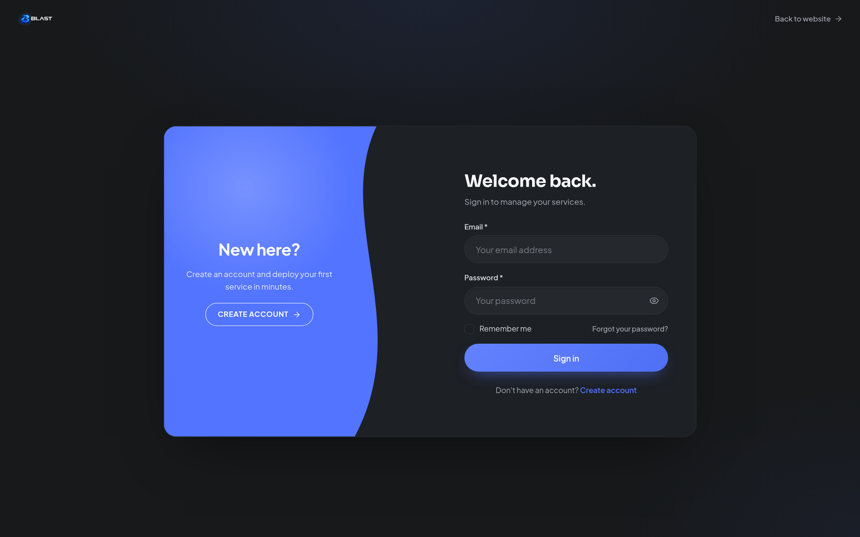
Fourteen designs
Pick a Page design and the whole page changes. All designs share the same form, layout controls and text settings — only the visual treatment differs.
| Design | Character |
|---|---|
| Blast | The signature look: a split layout with the form card and the Blast visual panel |
| Beams | Light beams sweeping behind the card |
| Nebula | Soft nebula clouds in your brand colour |
| Space | Deep space with a star field and horizon |
| Dots | A precise technical dot grid |
| Aurora | Flowing aurora ribbons |
| Minimal | The form alone, no visual side. Fastest to load and ultra-clean |
| Paths | Animated circuit paths, infrastructure-flavoured |
| Grain | A subtle film-grain texture over charcoal |
| Orbit | Concentric orbits with floating nodes |
| Showcase | Your own images in a slideshow beside the form |
| Framed | The form in a bold framed poster treatment |
| Quote | Leads with a customer quote |
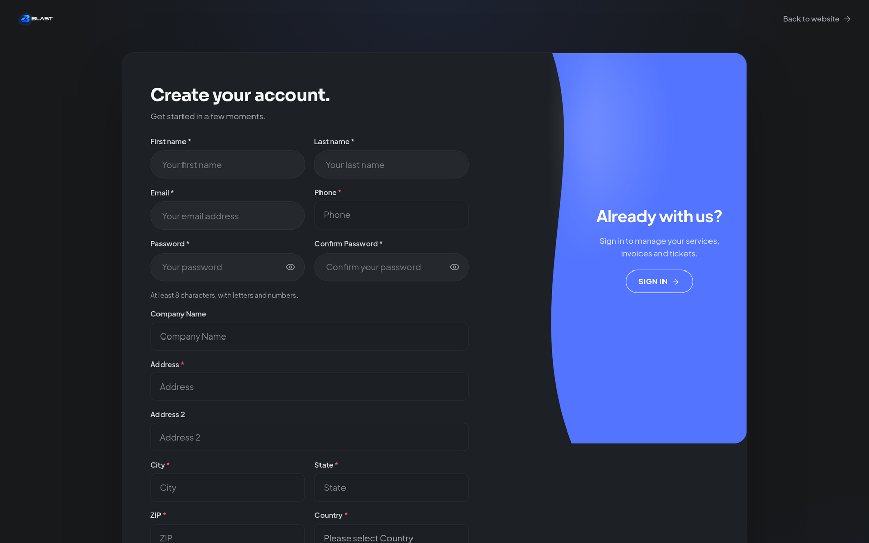
| Swap | Form and invite panel that swap emphasis between login and register |
Layout controls
| Setting | Options |
|---|---|
| Desktop layout | Form left, form right, or centred |
| Split ratio | 40 / 45 / 50 — how much space the visual side gets |
| Auth header | Minimal or compact top header |
| Back link label | Rename the "Back to website" link |
| Form density | Compact, normal or comfortable field spacing |
| Mobile visual | Hidden, compact, or full-height visual on phones |
Visual panel
For designs with a visual side:
- Visual type — infrastructure scene, gradient, minimal or none. The infrastructure scene is rendered live in your brand colour.
- Grid, glow and motion — toggle the scene's technical grid, ambient glow and animation independently. Turning all three off gives you a calm, static panel.
Social sign-in
If OAuth providers are configured in Paymenter — Google, Discord, GitHub and so on — Blast renders the provider buttons in the theme style:
- Presentation — automatic or hidden
- Divider text — for example "or continue with email"
- Button prefix — for example "Continue with"
- Icons — show or hide the provider icons
OAuth buttons only appear when configured
If you do not see them, the providers are not set up in Paymenter yet. Blast does not store or manage the credentials.
Every string is editable
Every piece of text is editable in the panel: the login heading and description, field labels, button labels — including the loading state, "Signing in…" — the register prompt and link, and the same for register, forgot-password, reset and verification pages. The whole journey can speak in your words.
Two design-specific details: Showcase slides takes one slide per line as path | caption, and Quote pages have quote text, author and role fields.
Tip for mobile
The visual panel is what makes these pages feel premium on a desktop, but it costs bytes. If auth pages matter to mobile visitors, set Mobile visual to hidden or compact, or choose the Minimal design outright.